Creating Dropdown Menus with QComboBox in PySide6

QComboBox is a versatile widget in PySide6 that allows users to select from a list of options in a compact dropdown format, making it ideal for forms, settings menus, and any interface where space-efficient choice selection is needed. This tutorial will walk you through its core functionalities, from basic setup to advanced customization, ensuring you can integrate it seamlessly into your applications.
Key Features
- Compact Selection Interface: Combines a display area for the current item with a dropdown list for options, supporting text, icons, and custom data.
- Editable Mode: Allows users to type in custom values, with options for validation and auto-completion.
- Item Management: Easily add, insert, remove, or clear items, including separators for better organization.
- Current Item Tracking: Properties like currentIndex, currentText, and currentData provide quick access to the selected option.
- Signals for Interactivity: Emits events like currentIndexChanged or currentTextChanged to respond to user selections dynamically.
- Customization Options: Control insertion policies, size adjustments, icon sizes, and more for tailored UI behavior.
- Model Integration: Can use underlying models for data population, enabling advanced features like sorting or filtering when combined with Model-View architecture.
Creating a QComboBox
Start by importing the necessary modules and creating an instance of QComboBox within a parent widget, such as a QWidget or QMainWindow. This sets up a basic dropdown that you can populate with items later. Here's a simple example to get a QComboBox up and running in a minimal application window.
import sys
from PySide6.QtWidgets import QApplication, QWidget, QComboBox, QVBoxLayout

class MainWindow(QWidget):
    def __init__(self):
        super().__init__()
        self.setWindowTitle("Basic QComboBox Example")

        layout = QVBoxLayout(self)

        self.combo = QComboBox()
        layout.addWidget(self.combo)

if __name__ == "__main__":
    app = QApplication(sys.argv)
    window = MainWindow()
    window.show()
    sys.exit(app.exec())
This creates an empty combo box in a window. You can now build on this by adding items.
Adding Items to the Combo Box
QComboBox provides flexible methods to populate the dropdown list, such as addItem for single entries or addItems for batches. You can include text, icons, or associated user data (stored in Qt.UserRole) for each item. Items are appended by default, but you can insert at specific positions using insertItem or insertItems.
import sys
from PySide6.QtWidgets import QApplication, QWidget, QComboBox, QVBoxLayout

class MainWindow(QWidget):
    def __init__(self):
        super().__init__()
        self.setWindowTitle("Basic QComboBox Example")

        layout = QVBoxLayout(self)

        self.combo = QComboBox()
        self.combo.addItem("Option 1")
        self.combo.addItem("Option 2")
        self.combo.addItems(["Option 3", "Option 4"])
        self.combo.currentIndexChanged.connect(self.on_selection_changed)
        layout.addWidget(self.combo)

    def on_selection_changed(self, index):
        print(f"Selected index: {index}, Text: {self.combo.currentText()}")

if __name__ == "__main__":
    app = QApplication(sys.argv)
    window = MainWindow()
    window.show()
    sys.exit(app.exec())
Use removeItem(index) to delete specific items or clear() to remove all. For visual separation, insertSeparator(index) adds non-selectable dividers.
self.combo.insertSeparator(1)
Making the Combo Box Editable
By default, QComboBox is non-editable, restricting users to predefined options. Set it to editable for free-form input, which uses a QLineEdit internally. Control where new user-entered items are inserted via the insertPolicy property (e.g., InsertAtTop or NoInsert).
import sys
from PySide6.QtWidgets import QApplication, QWidget, QComboBox, QVBoxLayout

class MainWindow(QWidget):
    def __init__(self):
        super().__init__()
        self.setWindowTitle("Basic QComboBox Example")

        layout = QVBoxLayout(self)

        self.combo = QComboBox()
        self.combo.addItem("Option 1")
        self.combo.addItem("Option 2", userData=42)
        self.combo.setEditable(True)  # Enable editing
        self.combo.setInsertPolicy(QComboBox.InsertAtTop)
        layout.addWidget(self.combo)

if __name__ == "__main__":
    app = QApplication(sys.argv)
    window = MainWindow()
    window.show()
    sys.exit(app.exec())
This mode is great for search-like interfaces, and you can pair it with completers or validators for enhanced usability.
Handling User Selections
Connect to signals like currentIndexChanged or currentTextChanged to react to changes. Use methods like setCurrentIndex or setCurrentText to programmatically select items. Retrieve selections with currentIndex(), currentText(), or currentData().
import sys
from PySide6.QtWidgets import QApplication, QWidget, QComboBox, QVBoxLayout

class MainWindow(QWidget):
    def __init__(self):
        super().__init__()
        self.setWindowTitle("Basic QComboBox Example")

        layout = QVBoxLayout(self)

        self.combo = QComboBox()
        self.combo.addItem("Option 1")
        self.combo.addItem("Option 2")
        self.combo.addItem("Option 3")
        self.combo.addItems(["Option 4", "Option 5"])
        self.combo.currentIndexChanged.connect(self.on_selection_changed)
        layout.addWidget(self.combo)

    def on_selection_changed(self, index):
        print(f"Selected index: {index}, Text: {self.combo.currentText()}")

if __name__ == "__main__":
    app = QApplication(sys.argv)
    window = MainWindow()
    window.show()
    sys.exit(app.exec())
Customizing Appearance and Behavior
Adjust properties like iconSize, maxVisibleItems, or sizeAdjustPolicy for better visuals and usability. For example, set a placeholderText for when no item is selected.
import sys
from PySide6.QtCore import QSize
from PySide6.QtWidgets import QApplication, QWidget, QComboBox, QVBoxLayout

class MainWindow(QWidget):
    def __init__(self):
        super().__init__()
        self.setWindowTitle("Basic QComboBox Example")
        layout = QVBoxLayout(self)
        self.combo = QComboBox()
        self.combo.addItem("Option 1")
        self.combo.addItem("Option 2")
        self.combo.addItem("Option 3")
        self.combo.addItems(["Option 4", "Option 5"])
        self.combo.setIconSize(QSize(16, 16))  # Small icons
        self.combo.setMaxVisibleItems(3)  # Limit dropdown height
        self.combo.setPlaceholderText("Select an option")  # Hint text
        self.combo.setCurrentIndex(-1)  # Ensure no item is selected
        self.combo.currentIndexChanged.connect(self.on_selection_changed)
        layout.addWidget(self.combo)

    def on_selection_changed(self, index):
        print(f"Selected index: {index}, Text: {self.combo.currentText()}")

if __name__ == "__main__":
    app = QApplication(sys.argv)
    window = MainWindow()
    window.show()
    sys.exit(app.exec())
Practical Example
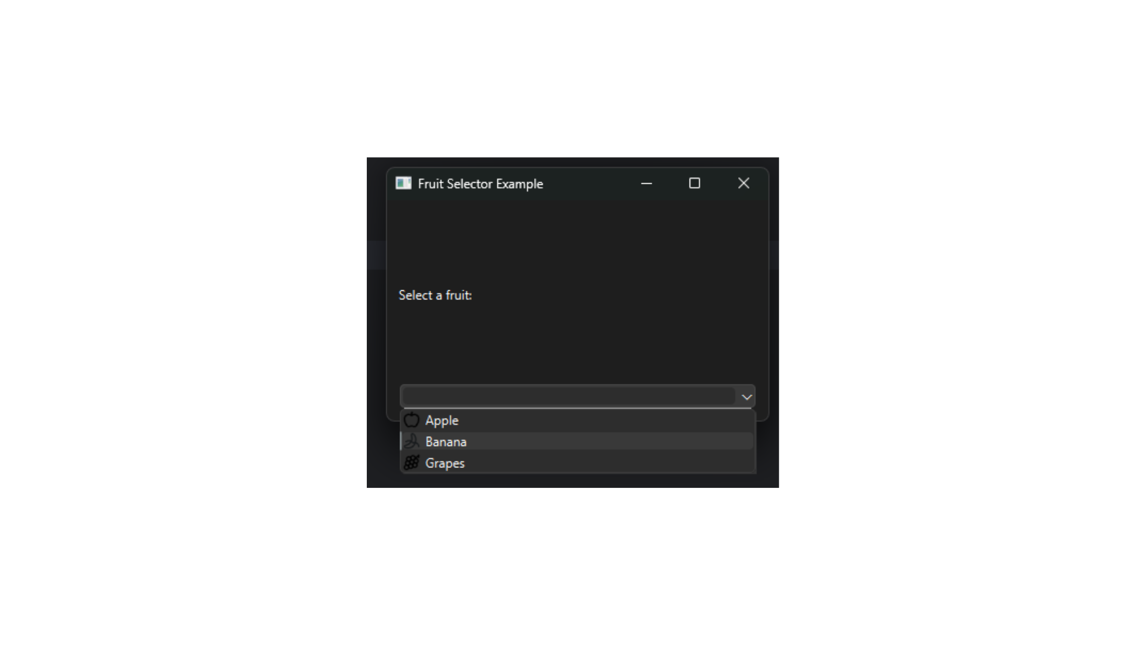
Here's a complete example combining QComboBox with a layout, editable mode, item addition (including icons and data), and selection handling. It demonstrates a simple fruit selector that updates a label on change.
import sys
from PySide6.QtWidgets import QApplication, QWidget, QComboBox, QVBoxLayout, QLabel
from PySide6.QtGui import QIcon
from PySide6.QtCore import Qt

class MainWindow(QWidget):
    def __init__(self):
        super().__init__()
        self.setWindowTitle("Fruit Selector Example")

        layout = QVBoxLayout(self)

        self.label = QLabel("Select a fruit:")
        layout.addWidget(self.label)

        self.combo = QComboBox()
        self.combo.setEditable(True)
        self.combo.setInsertPolicy(QComboBox.InsertAtTop)
        self.combo.setPlaceholderText("Choose or type a fruit")

        # Adding items with icons and data
        self.combo.addItem(QIcon("apple.png"), "Apple", userData={"price": 0.5})
        self.combo.addItem(QIcon("banana.png"), "Banana", userData={"price": 0.3})
        self.combo.addItem(QIcon("grape.png"), "Grapes", userData={"price": 0.6})

        self.combo.currentTextChanged.connect(self.on_selection_changed)

        layout.addWidget(self.combo)

    def on_selection_changed(self, text):
        data = self.combo.currentData(Qt.UserRole) if self.combo.currentData() else None
        self.label.setText(f"Selected: {text} (Data: {data})")

if __name__ == "__main__":
    app = QApplication(sys.argv)
    window = MainWindow()
    window.show()
    sys.exit(app.exec())
This script creates an interactive dropdown, handles custom inputs, and updates a label dynamically, showcasing real-world usage in a form-like interface.
For upcoming topics, explore integrating QComboBox with layouts in Module 3 for structured UIs, or connect it to signals and slots in Module 4 for more responsive event handling. Related concepts include using QComboBox in Model-View setups (Module 14) for data-driven selections or styling it in Module 10 for themed applications.
